Liquid Swipe

UPDATE: After the initial release, new code to handle Touch/Pointer interactions have been added. Check out the last section of this post.

A few days ago, I came across this beautiful swipe animation created in Flutter (thanks to Justin Xin Liu for showing it to me 😊 ).

The Flutter project can be found here.

I wondered if this animation can be recreated using Windows UI Composition. Looking at the Flutter project source code, the path was being calculated based on the revealPercent value. When you swipe from right to left, the revealPercent changes from 0 to 100. So all I had to do was animate revealPercent from 0 to 100 and calculate the geometry for each of the intermediate values to create a buttery smooth liquid swipe animation. Simple, right?

Strike One

I looked into my CompositionProToolkit library. My first thought was to use the IGeometrySurface to create the initial surface and then animate its geometry. But how do I create an animation to animate the geometry. Composition runs independent of the UI thread and provides buttery smooth animation. I thought I could create an expression animation and provide a custom method within the expression to calculate the geometry. I reached out to folks at Microsoft to know whether it was possible. (Thank you, Simeon Cran, for answering my questions).

This is the reply I got.

You cannot call a custom method from within the ExpressionAnimation. This is for a very good reason: the expression is being evaluated in the DWM process, not in your process. If DWM called out to other processes on each frame then its performance would depend on the performance of those processes. In the worst case a bug in a single app could prevent the screen from refreshing.

I then asked if I started a Composition animation, was it possible to get the intermediate value.

Your process cannot observe the intermediate value of any animation while it is running. It’s not possible because DWM would have to communicate that value to you, which could tank performance. Even if it did, the value will change by the time you were able to generate data for a new frame.

Strike Two

My next thought was to used PathKeyFrameAnimation to animate the CompositionPath. CompositionSpriteShape has a Geometry property. So I thought to define an ImplictAnimation for the Geometry property and use PathKeyFrameAnimation to animate the Geometry to its new Final Value. I used a Slider to mock the value change from 0 to 100.

var implicitAnimCollection = _c.CreateImplicitAnimationCollection();
var geomAnimation = _c.CreatePathKeyFrameAnimation();
geomAnimation.Target = "Geometry.Path";
geomAnimation.Duration = TimeSpan.FromMilliseconds(500);
geomAnimation.InsertExpressionKeyFrame(1f, "this.FinalValue", _c.CreateEaseInCubicEasingFunction());
implicitAnimCollection["Geometry"] = geomAnimation;

...

var geom = CanvasGeometry.CreateCircle(_g.Device, new Vector2(250), (float) e.NewValue);
_shape.Geometry = _c.CreatePathGeometry(new CompositionPath(geom));

But this didn’t work either! Simeon provided the answer.

In general, references are not animatable properties. That means that _shape.Geometry (which is a reference, not a value) cannot be animated nor serve as the input to an expression.

For a PathKeyFrameAnimation, each keyframe value is a CompositionPath (yes, that is an exception to the “references are not animatable properties” rule). Each CompositionPath must have the same number of control points. The animation engine will interpolate the control points between each path to give you a smooth change of shape as the animation progresses.

Home Run!

I realized I have to create the animation on my own!

Finally I decided to used Win2d. I needed a way to call my geometry calculating method at 60 fps without getting affected by the UI thread. I used the CanvasAnimatedControl. If you set its IsFixedTimeStep to True, then its Draw event would be fired 60 times per second. Perfect! Thread which would guarantee 60 fps, check!

I ported the code to calculate the geometry from the Flutter project. Geometry Calculator, check!

Now I had to create the easing functions for my animation. This site helped. Easing Functions, check!

Now how do I find a reliable way to calculate the elapsed time for my animation? System.Diagnostics.Stopwatch is here to help! Timekeeper, check!

Now I have the basic building blocks for my animation. Let’s play!

I created a ShapeVisual to hold all the layers which I would be animating. Then I created a few CompositionSpriteShape objects and added it to the root shape.

The Next and Previous button would trigger the animation. Whenever the animation is triggered, the Stopwatch would start and the Draw event handler would calculate the appropriate geometry for the current shape being animated.

Here is the result.

UPDATE: Touch Interactions

After the initial release, Michael Hawker (@XAMLLlama) suggested the following

I think with your approach now you could even do tracking of the user’s finger and have the animation/bump follow it around as they swipe, eh? (i.e. bump could move up too if their finger was higher.)

I thought about this for sometime and then replied

With the Swipe left or swipe right gesture, you can start the appropriate animation. If the user is just dragging, then updating the revealPercent variable would modify the geometry. At pointer up the remaining animation should be completed.

I couldn’t use InteractionTracker. So I set out to implement this by writing my own custom tracker for basic swipe interaction. I harnessed the three Pointer events for this purpose

  • PointerPressed – When the user touches the screen or clicks the mouse left button. Interaction starts at that point.
  • PointerMoved – When the user moves the finger or mouse across the screen. (I would have to also check if the user is still touching the screen or pressing the mouse left button).
  • PointerReleased – When the users lifts the finger or releases the mouse left button. This would mark the end of the interaction.

So now I have to differentiate between the Swipe and Drag gestures.

Swipe Gesture

The Swipe gesture would be short and fast interaction – the drag distance should be atleast a minimum distance (I set it to 20 pixels) and the duration between PointerPressed and PointerReleased events should be less than a minimum duration (450 ms) to qualify. If it is a swipe gesture, then I would have to animate the shape layer in the appropriate swipe direction.

Drag Gesture

If it does not qualify as a swipe gesture, I would have to calculate how much distance the pointer has moved during the PointerMoved event and calculate the _revealPercent and redraw the Shape geometry accordingly.

Upon the PointerReleased event, I calculate if the distance moved is above the threshold to complete the swipe. If yes, then I animate the shape’s geometry from the current position to the position where the gesture would be deemed complete.

Otherwise, I animate the shapes geometry to return it to its initial shape.

Updating the bubble’s vertical position

To update the vertical position of the bubble (or bump) within the shape, in all the three above pointer events, I would get the current position of the pointer and take its Y property and calculate the value of the _verticalReveal variable. This variable determines at what height, relative to the total height of the shape, the bubble should be rendered.

Finally this is what I achieved.

You can find the source here.

Happy Coding!

CompositionProToolkit v1.0 released.

Almost 4 years ago, on June 1, 2016 I published v0.1 of the CompositionProToolkit library. Today, it gives me immense pleasure to announce the v1.0 release of this library. I wish to thank the people in the developer community who have helped me by providing their valuable suggestions and sharing their feedback and experience.

So what’s new in v1.0?

CompositionProToolkit v1.0 includes of a couple of new RenderSurface interfaces, a new control to generate a colorful shadow, the rewrite of an existing control and the refactoring and overhaul of existing methods and controls.

Let’s go a little deeper into the details.

New RenderSurface interfaces

CompositionProToolkit provides rendering surface interfaces which can be used for , rendering custom shapes and images or creating masks from geometric shapes or images.

  • IRenderSurface – This interface acts as the base interface for interfaces which render to the ICompositionSurface. It mainly contains references to an ICompositionGenerator object and an ICompositionSurface object which are the core objects required for rendering any geometry or image onto a ICompositionSurface.
  • IMaskSurface – This interface is used for rendering custom shaped geometries onto ICompositionSurface so that they can be useds as masks on Composition Visuals.
  • IGaussianMaskSurface – This interface derives from IMaskSurface and is used for rendering custom shaped geometries onto ICompositionSurface so that they can be useds as masks on Composition Visuals. You can apply a Gaussian Blur to the mask.
  • IGeometrySurface – This interface is used for rendering custom shaped geometries onto ICompositionSurface.
  • IImageSurface – This interface is used for rendering images onto ICompositionSurface.
  • IImageMaskSurface – This interface is used for creating a mask using the alpha values of the image pixels.

IGaussianMaskSurface

The IGaussianMaskSurface interface allows you to create a mask and apply a Gaussian Blur to it. When you apply this mask to an image, it would appear to have a soft feathered

The following API is provided in ICompositionGenerator to create a IGaussianMaskSurface

IGaussianMaskSurface CreateGaussianMaskSurface(Size size, CanvasGeometry geometry, Vector2 offset, float blurRadius);

Here is how applying the GaussianMaskSurface to an image appears like

Notice the edges of the Final Output in the image when the Mask becomes blurred.

IImageMaskSurface

You can use an image to create an IImageMaskSurface. This uses the alpha values of the pixels in the image to create a mask.

ICompositionGenerator provides the following API which allows you to create an object implementing the IImageMaskSurface

IImageMaskSurface CreateImageMaskSurface(IImageMaskSurface imageMaskSurface);
IImageMaskSurface CreateImageMaskSurface(CanvasBitmap surfaceBitmap, Size size, Thickness padding, float blurRadius);
IImageMaskSurface CreateImageMaskSurface(CanvasBitmap surfaceBitmap, Size size, Thickness padding, ImageSurfaceOptions options);
IImageMaskSurface CreateImageMaskSurface(IImageSurface imageSurface, Size size, Thickness padding, ImageSurfaceOptions options);
Task<IImageMaskSurface> CreateImageMaskSurfaceAsync(Uri uri, Size size, Thickness padding, ImageSurfaceOptions options);

You can also apply a Gaussian blur to the mask by specifying the blur radius.

Here is an example of a IImageMaskSurface.

ImageMaskSurface example

The ColorShadow control primarily uses IImageMaskSurface to generate the shadow from the image.

Creating a Squircle

A Squircle is an intermediate shape between a square and a circle. CompositionProToolkit provides the following extension methods to create a Squircle in Composition layer or using Win2d.

public static CanvasGeometry CreateSquircle(ICanvasResourceCreator resourceCreator, float x, float y,
    float width, float height, float radiusX, float radiusY);

public static void DrawSquircle(this CanvasDrawingSession session, float x, float y, float w, float h,
    float radiusX, float radiusY, ICanvasStroke stroke);
public static void DrawSquircle(this CanvasDrawingSession session, float x, float y, float w, float h,
    float radiusX, float radiusY, Vector2 offset, ICanvasStroke stroke);
public static void FillSquircle(this CanvasDrawingSession session, float x, float y, float w, float h,
    float radiusX, float radiusY, Color color);
public static void FillSquircle(this CanvasDrawingSession session, float x, float y, float w, float h,
    float radiusX, float radiusY, ICanvasBrush brush);
public static void FillSquircle(this CanvasDrawingSession session, float x, float y, float w, float h,
    float radiusX, float radiusY, Vector2 offset, Color color);
public static void FillSquircle(this CanvasDrawingSession session, float x, float y, float w, float h,
    float radiusX, float radiusY, Vector2 offset, ICanvasBrush brush);

public static void AddSquircleFigure(this CanvasPathBuilder pathBuilder, float x, float y, float width,
    float height, float radiusX, float radiusY);

Although this shape may not be a perfect squircle, these methods generate an approximation of the Squircle shape.

FluidToggleSwitch

For this release, I rewrote the FluidToggleSwitch control in order to add better animations and improve the look and feel of the control. I added several properties to it so that it can be used as a replacement to the Windows Toggleswitch control. I also added a couple of properties – TargetVisibility and InverseTargetVisibility so that you can bind them to make another control Visible or Collapsed without the need for an IValueConverter.

If you want to use the FluidToggleSwitch in the dark theme environment, set the RequestedTheme property to Dark.

Here is the ToggleSwitch in action.

ColorShadow

The origin of the idea for the ColorShadow control can be traced back to this question. Back then I had some idea about how to implement this. I thought it would be a simple task of adding another visual in the background with a Blurred image brush. In the past few weeks, when I researched about how to implement this effect, I soon realized that it would require more effort that I previously anticipated.

My quest for the solution led me to create the IGaussianMaskSurface and then the IImageMaskSurface. In the end, I was happy how the control turned out.

Let us delve a little deeper into how ColorShadow control was implemented.

ColorShadow internally is composed of two layers – the top layer is used to display the original image while the bottom layer is used to display the shadow generated from the image.

Once the image is loaded onto the control, an ImageMaskSurface is created and the specified Gaussian blur is applied to it.

The area in black represents transparent pixels.

Then the image is blurred and a final CompositionMaskBrush is created by using the blurred image as the source and the CompositionSurfaceBrush, created using the ImageMaskSurface, as the mask. This mask brush is applied to the CompositionSpriteVisual at the bottom layer to generate a colorful shadow.

You can manipulate the ColorShadowPadding to define how big the bottom layer would be compared to the top layer. Also you can manipulate the ColorMaskPadding to define the padding of the mask within the bottom layer. As a best practice, keep the ColorMaskPadding less the the ColorShadowPadding.

ImageFrame

The ImageFrame control will no longer support ImageCaching. The Source property would now accept a Uri or a string which can be converted to a Uri. If you require image caching, check out the Windows Community Toolkit.

Easing Functions renamed

The Exponential easing extension methods did not have the word ‘Easing‘ in their names. So I updated their name to include the same. The following are the new methods

public static CubicBezierEasingFunction CreateEaseInExponentialEasingFunction(this Compositor compositor);
public static CubicBezierEasingFunction CreateEaseOutExponentialEasingFunction(this Compositor compositor);
public static CubicBezierEasingFunction CreateEaseInOutExponentialEasingFunction(this Compositor compositor);

The Road Ahead

Going forward, I am planning to move a few of the classes and methods from CompositionProToolkit to the Windows Community Toolkit. It would be done incrementally. A big thanks to the Windows Community Toolkit dev community in advance. I shall keep you all posted on the progress.

The latest code can be found on GitHub. The TokenGallery project provides a sample gallery of all the features and controls in CompositionProToolkit.

Happy Friday and Happy Coding! 😎

CompositionProToolkit v0.9.5 Released!

I had been planning this for a long time and am happy to announce that CompositionProToolkit v0.9.5 is now released.

It is built using Windows SDK 18362.

Two Nuget Packages

This version includes a bit of refactoring and splitting up the project into two – the core helper methods and the UI controls. Of late I had realized that developers who use this library mainly for the core helper methods need not carry the overhead of the UI controls created in this library. So now the project is split into two Nuget packages –CompositionProToolkit and CompositionProToolkit.Controls. This allows both projects to progress at a pace independent of each other.

While the core remains the same in this version, the Controls include a few tweaks.

FluidToggleSwitch

I have removed the circular background of FluidToggleSwitch. Now only the pill shaped track and circular thumb remain. The track now has a faint border around it.

FluidToggleSwitch

FluidBanner

FluidBanner now has two events – ItemsLoading and ItemsLoaded. Since images take time to load, FluidBanner now provides an event to notify when the loading of the images has begun (ItemsLoading) and when the loading has completed.

You can use these two events to show an indeterminate progress bar on top of the FluidBanner to indicate that the FluidBanner is loading.

FluidBanner

The source code is available here on GitHub.

Happy coding!


Creating a BĂ©zier connector

Introduction

BĂ©zier curves have been a fascinating and intriguing concept to me. Simply put, BĂ©zier curves allow us to define curves using mathematical equations. Harnessing these equations to bend the curves to our will can be daunting for those who are unfamiliar with the concept. If you wish to know about BĂ©zier curves in details, look at this excellent tutorial on BĂ©zier Curves.

Often, I have come across node graphs which show a set of nodes connected together, not by straight lines but nice curved lines. The curved lines give the graph a more sophisticated look. Here is a cool example of connectors used in BitWig Studio 3.

If you moved the nodes around, the curved lines adjusted their curvature accordingly. Initially I thought that, to accomplish this, some really complicated mathematical calculations need to be done to get the precise curvature in the connectors. However, when I gave it a closer look, I realized it was a simple Cubic BĂ©zier. In this post I will tell you how I achieved this

Beziers.gif

Cubic BĂ©zier

To define a cubic bĂ©zier, you need four points – two endpoints and two control points. The curve will always pass through the endpoints while they may or may not pass through the control points. The control points influence the curvature (see the image below).

BezierCurveManip.gif

(The above image was created from this awesome site.)

Creating a Cubic BĂ©zier connector

Say we are drawing a node graph and we need to connect two nodes with a Cubic BĂ©zier. To create a Cubic BĂ©zier, we already have the endpoints i.e. the predefined points within the node. What we need to calculate is the control points.

If you draw the tangent of the curve at the endpoints, you will see that the tangent is horizontal. It means that the curve is horizontal at the endpoints. To achieve this, the control point and its corresponding endpoint must lie on a horizontal line (i.e. their y-ordinate must be same). That makes matter more simple. We just need to calculate how far are the control points from their respective endpoints on the x-axis. To keep the curve uniform, I just calculate it the following way

var controlPointDistance = Math.Abs(endPoint1.X - endPoint2.X) / 2f;

Now that we have all the required points, we can render the bézier curve using the APIs provided by Windows. For example, using Win2d, you can create the curve in the following way

using (var pathBuilder = new CanvasPathBuilder(sender))
{
    pathBuilder.BeginFigure(endPoint1);
    pathBuilder.AddCubicBezier(controlPoint1, controlPoint2, endPoint2);
    pathBuilder.EndFigure(CanvasFigureLoop.Open);
    var geometry = CanvasGeometry.CreatePath(pathBuilder);
    drawingSession.DrawGeometry(geometry, Vector2.Zero, color, strokeThickness);
}

Using the above code you can render your own BĂ©zier connector.

BezierCurve.gif

The source code for the sample project is available in GitHub.

Happy Coding!

Having fun with CompositionGeometricClip and CompositionProToolkit v0.9!

In this post, I will be telling you about the new features available in the CompositionProToolkit v0.9 and will also explain in detail, how I used these features to create the following effect.

FluentCat.gif

About CompositionProToolkit v0.9

Today I am releasing CompositionProToolkit v0.9 which includes new extension methods and updates to existing features which will help the users use Composition APIs more efficiently. This release focuses on the CompositionGeometry related APIs.

NOTE: CompositioProToolkit v0.9 is built using Windows Insider SDK 17723. If you are not a Windows Insider and you are still on the April 2018 Update, this version might not work for you. Kindly use v0.8.

You can now use the Win2d Mini Path Language to create CompositionPath, CompositionPathGeometry, CompositionGeometricClip, CompositionSpriteShape objects. (If you want to know more about Win2d Mini Path Language see here)

Here are the APIs

public static CompositionPath CreatePath(this Compositor compositor, string pathData);
public static CompositionPathGeometry CreatePathGeometry(this Compositor compositor, string pathData);
public static CompositionSpriteShape CreateSpriteShape(this Compositor compositor, string pathData);
public static CompositionGeometricClip CreateGeometricClip(this Compositor compositor, CanvasGeometry geometry);
public static CompositionGeometricClip CreateGeometricClip(this Compositor compositor, string pathData);

Example

var pathData = "M 100, 100 L 200, 200 L100,300Z";
var shape = compositor.CreateSpriteShape(pathData);

var clipGeometry = compositor.CreateGeometricClip("O 200 200 150 150");

FrostedGlass Control

This new control has been added to CompositionProToolkit and it provides an efficient way of displaying an acrylic background (with rounded corners) to floating dialogs like Flyout, ContentDialog etc.

FrostedGlass control has the following properties

Dependency Property Type Description Default Value
TintColor Color The tint of the FrostedGlass. Colors.White
TintOpacity Double The opacity of the tint color 0.6
MultiplyAmount Double Indicates how much the multiplication result (Tint * Backdrop) should be included in the output image 1.0
BlurAmount Double The amount of blurring that should be done. 15.0
BackdropAmount Double The amount of backdrop brush that should be present in the Frosted Glass. Value should be within 0 and 1 (inclusive). 0.75
DisplayShadow Boolean Whether the shadow of the FrostedGlass should be displayed. True
ShadowColor Color The color of the shadow. Colors.Black
ShadowOpacity Double The opacity of the shadow. 0.5
ShadowBlurRadius Double The Blur Radius of the shadow. 16.0
ShadowOffsetX Double The offset of the shadow on the x-axis 4.0
ShadowOffsetY Double The offset of the shadow on the y-axis 4.0

Here is an example of creating a custom acrylic flyout

<Page.Resources>
    <Style x:Key="CustomFlyoutPresenterStyle" TargetType="FlyoutPresenter">
        <Setter Property="HorizontalContentAlignment" Value="Stretch" />
        <Setter Property="VerticalContentAlignment" Value="Stretch" />
        <Setter Property="IsTabStop" Value="False" />
        <Setter Property="Background" Value="{ThemeResource SystemControlBackgroundChromeMediumLowBrush}" />
        <Setter Property="BorderBrush" Value="{ThemeResource SystemControlForegroundChromeHighBrush}" />
        <Setter Property="BorderThickness" Value="{ThemeResource FlyoutBorderThemeThickness}" />
        <Setter Property="Padding" Value="{ThemeResource FlyoutContentThemePadding}" />
        <Setter Property="MinWidth" Value="800" />
        <Setter Property="MaxWidth" Value="800" />
        <Setter Property="MinHeight" Value="650" />
        <Setter Property="MaxHeight" Value="650" />
        <Setter Property="ScrollViewer.HorizontalScrollMode" Value="Auto" />
        <Setter Property="ScrollViewer.HorizontalScrollBarVisibility" Value="Auto" />
        <Setter Property="ScrollViewer.VerticalScrollMode" Value="Auto" />
        <Setter Property="ScrollViewer.VerticalScrollBarVisibility" Value="Auto" />
        <Setter Property="ScrollViewer.ZoomMode" Value="Disabled" />
        <Setter Property="Template">
            <Setter.Value>
                <ControlTemplate TargetType="FlyoutPresenter">
                    <Grid Background="Transparent">
                        <ContentPresenter
                            Margin="{TemplateBinding Padding}"
                            HorizontalAlignment="{TemplateBinding HorizontalContentAlignment}"
                            VerticalAlignment="{TemplateBinding VerticalContentAlignment}"
                            Content="{TemplateBinding Content}"
                            ContentTemplate="{TemplateBinding ContentTemplate}"
                            ContentTransitions="{TemplateBinding ContentTransitions}" />
                    </Grid>
                </ControlTemplate>
            </Setter.Value>
        </Setter>
    </Style>
    
    <Flyout x:Key="CustomFlyout" FlyoutPresenterStyle="{StaticResource CustomFlyoutPresenterStyle}">
        <Grid>
            <toolkit:FrostedGlass CornerRadius="8"
                                  MultiplyAmount="1"
                                  TintColor="#EFEFEF" />
            <!-- Additional Content goes below -->
        </Grid>
    </Flyout>
</Page.Resources>

<Button
    x:Name="CalligraphyPenButton"
    Margin="10,4,0,4"
    VerticalAlignment="Center"
    HorizontalAlignment="Center"
    FlyoutBase.AttachedFlyout="{StaticResource CustomFlyout}">    
</Button>

private void CalligraphyPenButton_OnClick(object sender, RoutedEventArgs e)
{
    FlyoutBase.ShowAttachedFlyout(CalligraphyPenButton);
}

Here is an example of a flyout using FrostedGlass in my Symmetro app Flyout_Previous

Fun with CompositionGeometricClip

About CompositionGeometricClip

Normally, the content of a Visual is rectangular in shape.

BeforeClip

You can now use the CompositionGeometricClip class to give the visual content a non-rectangular look.

AfterClipcombo.png

And the best feature of it – just like a Visual, CompositionGeometricClip has animatable properties!

RotatingClip

Now let us see how we can use the CompositionGeometricClip to create a cool effect.


Creating the visuals

In this example, we will be using a sample image (400 x 400 pixel resolution). We will use this to create a CompositionSurfaceBrush to apply to the visual of the same size.

var imageSurface = await _generator.CreateImageSurfaceAsync(
    new Uri("ms-appx:///Assets/Images/Cat.png"),
    new Size(400, 400), 
    ImageSurfaceOptions.Default);
var imageBrush = _compositor.CreateSurfaceBrush(imageSurface);

We will now create a bunch of visuals which will have the same CompositionSurfaceBrush applied. They will be stacked one on top of the other just like you stack a set of plates. If you try to visualize how the visual would look when viewed from a side it would be something like this.

ClipsSideVIewA

Now starting from the bottom, we need to apply a circular clip to each of the visual. The diameter of the circular clip will reduce as we move up from the bottom visual to the topmost. The side view would look something like this.

ClipsSideVIewB

The area colored red represents the clipped part of the visual (which will not be visible) while the area in blue will be displayed.

for (var i = 0; i < 145; i++)
{
  var visual = _compositor.CreateSpriteVisual();
  visual.Offset = new Vector3(400, 400, 0);
  visual.Size = new Vector2(400, 400);
  visual.Brush = imageBrush;
  visual.AnchorPoint = new Vector2(0.5f);
  var radius = 290 - (i * 2);
  // Create the GeometricClip for this visual
  var clipGeometry = CanvasGeometry.CreateCircle(null, new Vector2(200, 200), radius);
  visual.Clip = _compositor.CreateGeometricClip(clipGeometry);

  _rootVisual.Children.InsertAtTop(visual);
  _visuals.Add(visual);
}

Here is a sample stack of clipped visuals

Clips

Animating the offset of the visuals

Now we need to track the pointer when the pointer is pressed & dragged, and move the visuals in a buttery smooth way.

For this purpose we will divide the visuals into two groups.

The first group will consist of the top most visual only and it will track the pointer and animate its offset accordingly.

// Get the CompositionPropertySet which tracks the pointer position on the RootGrid
_pointerTrackerSet = ElementCompositionPreview.GetPointerPositionPropertySet(RootGrid);
// Animate the topmost visual so that it tracks and follows the pointer position
_pointerTrackerAnimation = _compositor.GenerateVector3KeyFrameAnimation()
    .HavingDuration(PointerTrackerAnimationDuration)
    .RepeatsForever();

_pointerTrackerAnimation.InsertExpressionKeyFrame(0f, c => new VisualTarget().Offset);
_pointerTrackerAnimation.InsertExpressionKeyFrame(
    1f,
    c => c.Lerp(new VisualTarget().Offset, _pointerTrackerSet.Get("Position"), DefaultLerpAmount),
    _compositor.CreateEaseOutQuinticEasingFunction());

When the pointer is pressed we will start the above animation for the topmost visual and stop it when the pointer is released.

The second group will contain the rest of the visuals and each visual will track the position of the visual above it and animate its own offset accordingly.

public sealed partial class CompositionGeometricClipPage : Page
{
  private Compositor _compositor;
  private ICompositionGenerator _generator;
  private SpriteVisual _dragVisual;
  private CompositionPropertySet _pointerTrackerSet;
  private SpriteVisual _rootVisual;
  private List<SpriteVisual> _visuals;
  private KeyFrameAnimation<Vector3> _pointerTrackerAnimation;

  private const float DefaultLerpAmount = 0.75f;
  private readonly TimeSpan ChildOffsetAnimationDuration = TimeSpan.FromSeconds(0.097f);
  private readonly TimeSpan PointerTrackerAnimationDuration = TimeSpan.FromSeconds(1f);

  public CompositionGeometricClipPage()
  {
    this.InitializeComponent();
    Loaded += OnPageLoaded;
    _visuals = new List<SpriteVisual>();
  }

  private async void OnPageLoaded(object sender, RoutedEventArgs e)
  {
    _compositor = Window.Current.Compositor;
    _generator = _compositor.CreateCompositionGenerator();
    var gridSize = new Vector2((float)RootGrid.ActualWidth, (float)RootGrid.ActualHeight);
    var anim =_compositor.CreatePathKeyFrameAnimation();
    _rootVisual = _compositor.CreateSpriteVisual();
    _rootVisual.Size = gridSize;

    // Create the surface brush from the image 
    var imageSurface = await _generator.CreateImageSurfaceAsync(
      new Uri("ms-appx:///Assets/Images/Cat.png"),
      new Size(400, 400), 
      ImageSurfaceOptions.Default);
    var imageBrush = _compositor.CreateSurfaceBrush(imageSurface);

    // Create the clipped visuals
    for (var i = 0; i < 145; i++)
    {
      var visual = _compositor.CreateSpriteVisual();
      visual.Offset = new Vector3(400, 400, 0);
      visual.Size = new Vector2(400, 400);
      visual.Brush = imageBrush;
      visual.AnchorPoint = new Vector2(0.5f);
      var radius = 290 - (i * 2);
      // Create the GeometricClip for this visual
      var clipGeometry = CanvasGeometry.CreateCircle(null, new Vector2(200, 200), radius);
      visual.Clip = _compositor.CreateGeometricClip(clipGeometry);

      _rootVisual.Children.InsertAtTop(visual);
      _visuals.Add(visual);
    }

    // Display the rootVisual
    ElementCompositionPreview.SetElementChildVisual(RootGrid, _rootVisual);

    // Reverse the visuals list so that the items in the list are now sorted
    // in z-order from top to bottom
    _visuals.Reverse();
    // The topmost visual would track the pointer position
    _dragVisual = _visuals.First();

    // Get the CompositionPropertySet which tracks the pointer position on the RootGrid
    _pointerTrackerSet = ElementCompositionPreview.GetPointerPositionPropertySet(RootGrid);
    // Animate the topmost visual so that it tracks and follows the pointer position
    _pointerTrackerAnimation = _compositor.GenerateVector3KeyFrameAnimation()
      .HavingDuration(PointerTrackerAnimationDuration)
      .RepeatsForever();

    _pointerTrackerAnimation.InsertExpressionKeyFrame(0f, c => new VisualTarget().Offset);
    _pointerTrackerAnimation.InsertExpressionKeyFrame(
      1f,
      c => c.Lerp(new VisualTarget().Offset, _pointerTrackerSet.Get<Vector3>("Position"), DefaultLerpAmount),
      _compositor.CreateEaseOutQuinticEasingFunction());

    // Animate the remaining visuals in such a way that each visual tracks and follows the
    // position of the visual above it.
    var prevChild = _dragVisual;
    foreach (var child in _visuals.Skip(1))
    {
      var offsetAnimation = _compositor.GenerateVector3KeyFrameAnimation()
                        .HavingDuration(ChildOffsetAnimationDuration)
                        .RepeatsForever();

      offsetAnimation.InsertExpressionKeyFrame(0f, c => new VisualTarget().Offset);
      offsetAnimation.InsertExpressionKeyFrame(
        1f,
        c => c.Lerp(new VisualTarget().Offset, prevChild.Offset, DefaultLerpAmount),
        _compositor.CreateEaseOutQuinticEasingFunction());

      child.StartAnimation(() => child.Offset, offsetAnimation);

      prevChild = child;
    }
  }

  /// <summary>
  /// Starts the animation to follow the pointer position
  /// </summary>
  /// <param name="sender">Pointer</param>
  /// <param name="e">PointerRoutedEventArgs</param>
  private void OnPointerPressed(object sender, PointerRoutedEventArgs e)
  {
    _dragVisual.StartAnimation(() => _dragVisual.Offset, _pointerTrackerAnimation);
  }

  /// <summary>
  /// Starts the animation to follow the pointer position
  /// </summary>
  /// <param name="sender">Pointer</param>
  /// <param name="e">PointerRoutedEventArgs</param>
  private void OnPointerReleased(object sender, PointerRoutedEventArgs e)
  {
    _dragVisual.StopAnimation(() => _dragVisual.Offset);
  }
}

You can check out the complete code in SampleGallery

You must have noticed that, in the above code, around 145 animations are simultaneously executing. I was initally doubtful whether running so many animations would have high CPU utilization.

However, upon executing the code, I was amazed to find that the CPU utilization never went over 1% and the whole animation was buttery smooth! Kudos to the Composition team!

FluentCat

The latest source code is available in GitHub and the Nuget package is available here.

Happy Coding! 🙂

CompositionProToolkit v0.7 Released

This update of CompositionProToolkit brings a breaking change and introduces two new controls which are completely written using Composition APIs.

Breaking Change : CompositionGeneratorFactory is deprecated!

CompositionGeneratorFactory class has been deprecated and removed. Now you can use the Compositor‘s CreateCompositionGenerator() method to instantiate the  CompositionGenerator.


var generator = compositor.CreateCompositionGenerator();

FluidToggleSwitch

FluidToggleSwitch

FluidToggleSwitch is a toggleswitch control which uses Composition Visuals to render its components and provides a richer look and feel to the ToggleSwitch control. There are three primary components within the ToggleSwitch

  • Background – The outermost circular area.
  • Track – The pill shaped area.
  • Thumb – The innermost circular area.

The reason FluidToggleSwitch is encapsulated with a circular background component is because the hit area for a touch input is normally circular.

The following properties allow you to customize the FluidToggleSwitch

Dependency Property Type Description Default Value
ActiveColor Color Gets or sets the Color of the FluidToggleSwitch in Checked state. #4cd964
InactiveColor Color Gets or sets the Color of the FluidToggleSwitch in Unchecked state. #dfdfdf
DisabledColor Color Gets or sets the Color of the FluidToggleSwitch in Disabled state. #eaeaea

The above properties define the color of the Background component. The color of the Track component is derived automatically from the above properties. The color of the Thumb is white.

ProfileControl

ProfileControl

ProfileControl allows you to display an image (normally a user profile image) in an intuitive way. This control is mainly implemented using Composition Visuals and animations which provide a rich user experience. Depending on the width and height of the ProfileControl, its shape can be either circular or elliptical. There are two main components within the ProfileControl

  • Background Visual – The outermost circular or elliptical area. This area is filled with the CompositionBackdropBrush which blends the control with whatever is rendered beneath the control.
  • Image Visual – The innermost circular or elliptical area. This area renders the image provided.

The following properties allow you to customize the ProfileControl

Dependency Property Type Description Default Value
BlurRadius Double Gets or sets the amount by which the brush of the Background Visual must be blurred. 20.0
BorderGap Double Gets or sets the uniform gap between the Background visual and the Image visual. 10.0
FluidReveal Boolean Indicates whether the reveal animation should automatically be played when the Source property of the ProfileControl changes. If set to False, the image specified by the Source property is displayed directly without any animation. True
RevealDuration TimeSpan Gets or sets the duration of the reveal animation. 1 sec
Source Uri Gets or sets the Uri of the image to be displayed in the ProfileControl. null
Stretch Stretch Indicates how the image content is resized to fill its allocated space in the Image Visual. Stretch.Uniform
Tint Color Gets or sets the color overlay on the background of the ProfileControl. Colors.White

I shall provide more details into how these controls were implemented using Composition APIs in my next post.

Source Code, Nuget & Documentation

Happy Coding! 🙂

CompositionProToolkit v0.6 Released!

cpt_banner

Well, it has been almost 6 months since my last post. I have been busy working on a few apps and learning a few new technologies. In the meantime, Windows 10 Creators update was released, Build 2017 happened and Microsoft introduced the Fluent Design System (a much needed feature for Windows 10 UX). The Windows Composition team also open sourced the Expression Builder code which allows you to define the expressions in ExpressionAnimations in a more intuitive way.

A couple of weeks ago, I felt it was time to revisit my code in CompositionProToolkit and update it to the latest Windows SDK features. CompositionProToolkit version 0.5.x releases were more biased towards Win2d. So I decided to dedicate version 0.6 to the CompositionProToolkit.Expressions namespace.

cpte_banner

I had a look at the Expression Builder code to understand its features. It helps the developers to create type-safe expressions using ExpressionNode (and its derivatives). I was wondering if there was a way to modify the authoring feature in such a way that the ExpressionNode (and its derivatives) remain hidden from view to the developer and s/he may use a more simpler way to specify the expression with type-safety (using Lambda expressions).

It was then I realized the code in CompositionProToolkit.Expressions namespace did not support creation of expression templates.

I realized that there was a huge scope of improvement in the CompositionProToolkit.Expressions namespace and it was possible to introduce templates within the lambda expressions.

Thus, I am happy to announce that with the release of CompositionProToolkit v0.6, Expression parsing is more robust now. A lot of extension methods have been added to help the developer minimize the code written to create animations.

Defining the ExpressionAnimation and KeyFrameAnimation

The following extension methods have been defined on the Compositor to create the appropriate ExpressionAnimation object.

public static ExpressionAnimation CreateColorExpressionAnimation(this Compositor compositor);
public static ExpressionAnimation CreateQuaternionExpressionAnimation(this Compositor compositor);
public static ExpressionAnimation CreateScalarExpressionAnimation(this Compositor compositor);
public static ExpressionAnimation CreateVector2ExpressionAnimation(this Compositor compositor);
public static ExpressionAnimation CreateVector3ExpressionAnimation(this Compositor compositor);
public static ExpressionAnimation CreateVector4ExpressionAnimation(this Compositor compositor);
public static ExpressionAnimation CreateMatrix4x4ExpressionAnimation(this Compositor compositor);

The following extension method is defined for the Compositor to create a KeyFrameAnimation object for the appropriate animating property

public static KeyFrameAnimation GenerateColorKeyFrameAnimation(this Compositor compositor);
public static KeyFrameAnimation GenerateQuaternionKeyFrameAnimation(this Compositor compositor);
public static KeyFrameAnimation GenerateScalarKeyFrameAnimation(this Compositor compositor);
public static KeyFrameAnimation GenerateVector2KeyFrameAnimation(this Compositor compositor);
public static KeyFrameAnimation GenerateVector3KeyFrameAnimation(this Compositor compositor);
public static KeyFrameAnimation GenerateVector4KeyFrameAnimation(this Compositor compositor);

After creating the ExpressionAnimation object you can set its Expression property with the appropriate Expression.

The following extension methods allow StartAnimation to be called directly using an ExpressionAnimation or a KeyFrameAnimation object.

public static void StartAnimation(this CompositionObject compositionObject,
    Expression expression, KeyFrameAnimation keyframeAnimation);
public static void StartAnimation(this CompositionObject compositionObject,
    Expression expression, ExpressionAnimation expressionAnimation);

Using CompositionPropertySet within the Expression

In order to use a CompositionPropertySet within the Expression the following GetXXX extension methods have been defined

public static bool GetBoolean(this CompositionPropertySet propertySet, string key);
public static Color GetColor(this CompositionPropertySet propertySet, string key);
public static Matrix3x2 GetMatrix3x2(this CompositionPropertySet propertySet, string key);
public static Matrix4x4 GetMatrix4x4(this CompositionPropertySet propertySet, string key);
public static Quaternion GetQuaternion(this CompositionPropertySet propertySet, string key);
public static float GetScalar(this CompositionPropertySet propertySet, string key);
public static Vector2 GetVector2(this CompositionPropertySet propertySet, string key);
public static Vector3 GetVector3(this CompositionPropertySet propertySet, string key);
public static Vector4 GetVector4(this CompositionPropertySet propertySet, string key);

Expression Targets and Templates

It is now possible to use the new operator inside expressions. You can also define Expression Targets and Expression Templates within the Expression.

Expression Targets allow you to access the composition object (on which the expression animation is executed) within the expression.

Expression Templates allow you to reuse an expression by connecting them to different references (thus creating separate animations). It is similar to the way C# Generics allows you to define a class template and reuse the template for different types.

Here is an example

var visual = _compositor.CreateSpriteVisual();
visual.Offset = new Vector3(20, 30, 40);
visual.Size = new Vector2(200, 100);

var delta = new Vector3(50);

var offsetAnimation = _compositor.CreateVector3ExpressionAnimation();
offsetAnimation.Expression = 
    c => new VisualReference("myVisual").CenterPoint + new Vector3(10, 20, 30) + delta;
offsetAnimation.SetReference("myVisual", visual);

visual.StartAnimation(() => visual.CenterPoint, offsetAnimation);

var visual2 = _compositor.CreateSpriteVisual();
visual2.Offset = new Vector3(10, 10, 10);
visual2.Size = new Vector2(100, 100);

offsetAnimation.SetReference("myVisual", visual2);
offsetAnimation.SetReference("delta", new Vector3(100));

visual2.StartAnimation(() => visual2.CenterPoint, offsetAnimation);

Using Arrays in Expression

You can use an Array of objects deriving from CompositionObject within your Expression.

Example

var visual1 = compositor.CreateSpriteVisual();
...
var visual2 = compositor.CreateSpriteVisual();
...
var visualArray = new Visual[] { visual1, visual2 };

var offsetAnimation = compositor.CreateVector3ExpressionAnimation();
offsetAnimation.Expression = c => visualArray[0].Offset + new Vector(20);

visualArray[1].StartAnimation(() => visualArray[1].Offset, offsetAnimation);

Using List<> in Expression

You can use a List<> of objects deriving from CompositionObject within your Expression.

Example

var visual1 = compositor.CreateSpriteVisual();
...
var visual2 = compositor.CreateSpriteVisual();
...
var visualList = new List { visual1, visual2 };

var offsetAnimation = compositor.CreateVector3ExpressionAnimation();
offsetAnimation.Expression = c => visualList[0].Offset + new Vector(20);

visualList[1].StartAnimation(() => visualList[1].Offset, offsetAnimation);

Using Dictionary<,> in Expression

You can use a Dictionary<TKey, TValue> within your Expression.

TKey can be of types – int, float, double or string.

TValue should be an object deriving from CompositionObject.

Example

var visual1 = compositor.CreateSpriteVisual();
...
var visual2 = compositor.CreateSpriteVisual();
...
var visualDictionary = new Dictionary<string, Visual> 
    {
        ["first"] = visual1, 
        ["second"] = visual2 
    };

var offsetAnimation = compositor.CreateVector3ExpressionAnimation();
offsetAnimation.Expression = c => visualDictionary["first"].Offset + new Vector(20);

visualDictionary["second"].StartAnimation(() => visualDictionary["second"], offsetAnimation);

Custom Cubic Bezier Easing Functions

The following extension methods have been added to Compositor to create predefined CubicBezierEasingFunctions (these custom cubic bezier easing functions are based on the Robert Penner’s Easing Equations and the values are obtained from Ceaser CSS Easing Animation Tool )

public static CubicBezierEasingFunction CreateEaseInBackEasingFunction();
public static CubicBezierEasingFunction CreateEaseInCircleEasingFunction();
public static CubicBezierEasingFunction CreateEaseInCubicEasingFunction();
public static CubicBezierEasingFunction CreateEaseInExponentialFunction();
public static CubicBezierEasingFunction CreateEaseInQuadraticEasingFunction();
public static CubicBezierEasingFunction CreateEaseInQuarticEasingFunction();
public static CubicBezierEasingFunction CreateEaseInQuinticEasingFunction();
public static CubicBezierEasingFunction CreateEaseInSineEasingFunction();

public static CubicBezierEasingFunction CreateEaseOutBackEasingFunction();
public static CubicBezierEasingFunction CreateEaseOutCircleEasingFunction();
public static CubicBezierEasingFunction CreateEaseOutCubicEasingFunction();
public static CubicBezierEasingFunction CreateEaseOutExponentialFunction();
public static CubicBezierEasingFunction CreateEaseOutQuadraticEasingFunction();
public static CubicBezierEasingFunction CreateEaseOutQuarticEasingFunction();
public static CubicBezierEasingFunction CreateEaseOutQuinticEasingFunction();
public static CubicBezierEasingFunction CreateEaseOutSineEasingFunction();

public static CubicBezierEasingFunction CreateEaseInOutBackEasingFunction();
public static CubicBezierEasingFunction CreateEaseInOutCircleEasingFunction();
public static CubicBezierEasingFunction CreateEaseInOutCubicEasingFunction();
public static CubicBezierEasingFunction CreateEaseInOutExponentialFunction();
public static CubicBezierEasingFunction CreateEaseInOutQuadraticEasingFunction();
public static CubicBezierEasingFunction CreateEaseInOutQuarticEasingFunction();
public static CubicBezierEasingFunction CreateEaseInOutQuinticEasingFunction();
public static CubicBezierEasingFunction CreateEaseInOutSineEasingFunction();

DeviceLostHelper

CompositionProToolkit now uses the DeviceLostHelper class (provided in the WindowsUIDevLabs Sample Gallery application) to watch for CanvasDevice and it raises an appropriate event when the device is lost.

Project structure and Nuget

CompositionProToolkit v0.6 also revamps the project structure. The CompositionProToolkit.Ref project has been discarded and the CompositionDeviceHelper project has been added. It is a C++/CX project which encapsulates the DeviceLostHelper class.

The CompositionProToolkit.nuspec has also been updated. Now it includes the XML documentation file to provide better Intellisense support when using CompositionProToolkit in your code. I had some issues creating a single Nuget package targeting x86, x64 & ARM – which internally contained a UWP library and a Windows Runtime Component. There is no clear documentation provided for this scenario. I had to refer through numerous blogs and forum posts to finally get the nuget structure right. I will write in more detail about this in my next blog post.

Source Code, Nuget & Documentation

Happy Coding!

CompositionProToolkit v0.5.1 released : Win2d Mini Language

cpt_banner

Well, this is the first update for CompositionProToolkit in 2017, and it has turned out to be a huge update. I continued to build upon the work which I had started in the previous update i.e. parsing the SVG path language to convert it to CanvasGeometry. Now I am happy to announce that in this version, I have added more features to the existing path language, more commands to represent new shapes, brushes and strokes. It has now evolved into a more robust language which I am terming as the Win2d Mini Language.

In this post, I shall be explaining the work done to incorporate Win2d Mini Language into CompositionProToolkit and other related features.

ICanvasStroke and CanvasStroke

In Win2d, the stroke, that is used to render an outline to a CanvasGeometry, is comprised of three components

  • Stroke Width – defines the width of the stroke.
  • Stroke Brush – defines the ICanvasBrush that will be used to render the stroke.
  • Stroke Style – defines the CanvasStrokeStyle for the stroke.

ICanvasStroke interface, defined in the CompositionProToolkit.Win2d namespace, encapsulates these three components and the CanvasStroke class implements this interface. It provides several constructors to define the stroke.

public interface ICanvasStroke
{
  ICanvasBrush Brush { get; }
  float Width { get; }
  CanvasStrokeStyle Style { get; }
  Matrix3x2 Transform { get; set; }
}

public sealed class CanvasStroke : ICanvasStroke
{
  public float Width { get; }
  public CanvasStrokeStyle Style { get; }
  public ICanvasBrush Brush { get; }
  public Matrix3x2 Transform { get; set; }
  public CanvasStroke(ICanvasBrush brush, float strokeWidth = 1f);
  public CanvasStroke(ICanvasBrush brush, float strokeWidth, CanvasStrokeStyle strokeStyle);
  public CanvasStroke(ICanvasResourceCreator device, Color strokeColor, float strokeWidth = 1f);
  public CanvasStroke(ICanvasResourceCreator device, Color strokeColor, float strokeWidth, 
                      CanvasStrokeStyle strokeStyle);
}

The Transform property in CanvasStroke gets or sets the Transform property of the stroke brush.

IGeometrySurface

The IGeometrySurface interface is now updated to include ICanvasStroke to specify the definition of the stroke to be rendered on its geometry.

The following APIs are provided in ICompositionGenerator to create a IGeometrySurface

IGeometrySurface CreateGeometrySurface(Size size, CanvasGeometry geometry, 
    ICanvasStroke stroke);
IGeometrySurface CreateGeometrySurface(Size size, CanvasGeometry geometry, 
    Color fillColor);
IGeometrySurface CreateGeometrySurface(Size size, CanvasGeometry geometry,
    ICanvasStroke stroke, Color fillColor);
IGeometrySurface CreateGeometrySurface(Size size, CanvasGeometry geometry,
    Color fillColor, Color backgroundColor);
IGeometrySurface CreateGeometrySurface(Size size, CanvasGeometry geometry,
    ICanvasStroke stroke, Color fillColor, Color backgroundColor);
IGeometrySurface CreateGeometrySurface(Size size, CanvasGeometry geometry,
    ICanvasBrush fillBrush);
IGeometrySurface CreateGeometrySurface(Size size, CanvasGeometry geometry,
    ICanvasStroke stroke, ICanvasBrush fillBrush);
IGeometrySurface CreateGeometrySurface(Size size, CanvasGeometry geometry,
    ICanvasBrush fillBrush, ICanvasBrush backgroundBrush);
IGeometrySurface CreateGeometrySurface(Size size, CanvasGeometry geometry,
    ICanvasStroke stroke, ICanvasBrush fillBrush, ICanvasBrush backgroundBrush);
IGeometrySurface CreateGeometrySurface(Size size, CanvasGeometry geometry,
    ICanvasBrush fillBrush, Color backgroundColor);
IGeometrySurface CreateGeometrySurface(Size size, CanvasGeometry geometry,
    ICanvasStroke stroke, ICanvasBrush fillBrush, Color backgroundColor);
IGeometrySurface CreateGeometrySurface(Size size, CanvasGeometry geometry,
    Color fillColor, ICanvasBrush backgroundBrush);
IGeometrySurface CreateGeometrySurface(Size size, CanvasGeometry geometry,
    ICanvasStroke stroke, Color fillColor, ICanvasBrush backgroundBrush);    
IGeometrySurface CreateGeometrySurface(Size size, CanvasGeometry geometry,
    Color foregroundColor);
IGeometrySurface CreateGeometrySurface(Size size, CanvasGeometry geometry,
    Color foregroundColor, Color backgroundColor);
IGeometrySurface CreateGeometrySurface(Size size, CanvasGeometry geometry,
    ICanvasBrush foregroundBrush);
IGeometrySurface CreateGeometrySurface(Size size, CanvasGeometry geometry,
    ICanvasBrush foregroundBrush, ICanvasBrush backgroundBrush);
IGeometrySurface CreateGeometrySurface(Size size, CanvasGeometry geometry,
    ICanvasBrush foregroundBrush, Color backgroundColor);
IGeometrySurface CreateGeometrySurface(Size size, CanvasGeometry geometry,
    Color foregroundColor, ICanvasBrush backgroundBrush);

IGeometrySurface now provides several additional APIs which allow you to update its geometry, size, stroke, fill and background (and thus the shape of the Visual).

void Redraw(CanvasGeometry geometry);
void Redraw(ICanvasStroke stroke);
void Redraw(Color fillColor);
void Redraw(ICanvasStroke stroke, Color fillColor);
void Redraw(Color fillColor, Color backgroundColor);
void Redraw(ICanvasStroke stroke, Color fillColor, Color backgroundColor);
void Redraw(ICanvasBrush fillBrush);
void Redraw(ICanvasStroke stroke, ICanvasBrush fillBrush);
void Redraw(ICanvasBrush fillBrush, ICanvasBrush backgroundBrush);
void Redraw(ICanvasStroke stroke, ICanvasBrush fillBrush, 
    ICanvasBrush backgroundBrush);
void Redraw(Color fillColor, ICanvasBrush backgroundBrush);
void Redraw(ICanvasStroke stroke, Color fillColor, 
    ICanvasBrush backgroundBrush);
void Redraw(ICanvasBrush fillBrush, Color backgroundColor);
void Redraw(ICanvasStroke stroke, ICanvasBrush fillBrush, 
    Color backgroundColor);
void Redraw(Size size, CanvasGeometry geometry);
void Redraw(Size size, CanvasGeometry geometry, ICanvasStroke stroke);
void Redraw(Size size, CanvasGeometry geometry, Color fillColor);
void Redraw(Size size, CanvasGeometry geometry, ICanvasStroke stroke, 
    Color fillColor);
void Redraw(Size size, CanvasGeometry geometry, Color fillColor, 
    Color backgroundColor);
void Redraw(Size size, CanvasGeometry geometry, ICanvasStroke stroke,
    Color fillColor, Color backgroundColor);
void Redraw(Size size, CanvasGeometry geometry, ICanvasBrush fillBrush);
void Redraw(Size size, CanvasGeometry geometry, ICanvasBrush fillBrush,
    ICanvasBrush backgroundBrush);
void Redraw(Size size, CanvasGeometry geometry, ICanvasStroke stroke,
    ICanvasBrush fillBrush, ICanvasBrush backgroundBrush);
void Redraw(Size size, CanvasGeometry geometry, ICanvasBrush fillBrush,
    Color backgroundColor);
void Redraw(Size size, CanvasGeometry geometry, ICanvasStroke stroke,
    ICanvasBrush fillBrush, Color backgroundColor);
void Redraw(Size size, CanvasGeometry geometry, Color fillColor,
    ICanvasBrush backgroundBrush);
void Redraw(Size size, CanvasGeometry geometry, ICanvasStroke stroke,
    Color fillColor, ICanvasBrush backgroundBrush);

CanvasDrawingSession extension methods

The following extension methods have been created for CanvasDrawingSession to incorporate ICanvasStroke in its DrawXXX() methods

public static void DrawCircle(this CanvasDrawingSession session,
    Vector2 centerPoint, float radius, ICanvasStroke stroke);
public static void DrawCircle(this CanvasDrawingSession session,
    float x, float y, float radius, ICanvasStroke stroke);
public static void DrawEllipse(this CanvasDrawingSession session, 
    Vector2 centerPoint, float radiusX, float radiusY, ICanvasStroke stroke);
public static void DrawEllipse(this CanvasDrawingSession session,
    float x, float y, float radiusX, float radiusY, ICanvasStroke stroke);
public static void DrawGeometry(this CanvasDrawingSession session,
    CanvasGeometry geometry, ICanvasStroke stroke);
public static void DrawGeometry(this CanvasDrawingSession session,
    CanvasGeometry geometry, Vector2 offset, ICanvasStroke stroke);
public static void DrawGeometry(this CanvasDrawingSession session,
    CanvasGeometry geometry, float x, float y, ICanvasStroke stroke);
public static void DrawLine(this CanvasDrawingSession session, Vector2 point0, 
    Vector2 point1, ICanvasStroke stroke);
public static void DrawLine(this CanvasDrawingSession session, float x0, 
    float y0, float x1, float y1, ICanvasStroke stroke);
public static void DrawRectangle(this CanvasDrawingSession session, Rect rect, 
    ICanvasStroke stroke) ;
public static void DrawRectangle(this CanvasDrawingSession session, float x, 
    float y, float w, float h, ICanvasStroke stroke);
public static void DrawRoundedRectangle(this CanvasDrawingSession session, 
    Rect rect, float radiusX, float radiusY, ICanvasStroke stroke);
public static void DrawRoundedRectangle(this CanvasDrawingSession session, float x,
    float y, float w, float h, float radiusX, float radiusY, ICanvasStroke stroke);

Win2d MiniLanguage specification

The CanvasGeometry class facilitates the drawing and manipulation of complex geometrical shapes. These shapes can be outlined with a stroke and filled with a brush (which can be a solid color, a bitmap pattern or a gradient).

While the CanvasGeometry class provides various static methods to create predefined shapes like Circle, Ellipse, Rectangle, RoundedRectangle, the CanvasPathBuilder class provides several methods to create freeform CanvasGeometry objects.

Creation of a complex freeform geometric shape may involve invoking of several CanvasPathBuilder commands. For example, the following code shows how to create a triangle geometry using CanvasPathBuilder

CanvasPathBuilder pathBuilder = new CanvasPathBuilder(device);

pathBuilder.BeginFigure(1, 1);
pathBuilder.AddLine(300, 300);
pathBuilder.AddLine(1, 300);
pathBuilder.EndFigure(CanvasFigureLoop.Closed);

CanvasGeometry triangleGeometry = CanvasGeometry.CreatePath(pathBuilder);

Win2d Mini Language is a powerful and sophisticated language which facilitates specifying complex geometries, color, brushes, strokes and stroke styles in a more compact manner.

Using Win2d Mini-Language, the geometry in above example can be created in the following way

string pathData = “M 1 1 300 300 1 300 Z”;
CanvasGeometry triangleGeometry = CanvasObject.CreateGeometry(device, pathData);

Win2d Mini Language now contains additional commands which allow easy creation of ICanvasBrush, ICanvasStroke, Color and CanvasStrokeStyle.

Win2d Mini Language is based on the SVG (Scalable Vector Graphics) Path language specification.

The following specification document describes the Win2d Markup Language in detail.

Win2d Mini Language Specification.pdf

Parsing Win2d Mini Language with CanvasObject

The CanvasObject static class replaces the CanvasGeometryParser static class and provides APIs that parse the Win2d Mini Language and instantiate the appropriate objects.

Color

From Hexadecimal Color string

There are two APIs that convert the hexadecimal color string in #RRGGBB or #AARRGGBB format to the corresponding Color object. The ‘#‘ character is optional.

public static Color CreateColor(string hexColor);
public static bool TryCreateColor(string hexColor, out Color color);

The first API will raise an ArgumentException if the argument is not in the correct format while the second API will attempt to convert the color string without raising an exception.

From High Dynamic Range Color string

The following API Converts a Vector4 High Dynamic Range Color to Color object. Negative components of the Vector4 will be sanitized by taking the absolute value of the component. The HDR Color components should have value in the range [0, 1]. If their value is more than 1, they will be clamped at 1. Vector4’s X, Y, Z, W components match to Color’s R, G, B, A components respectively.

public static Color CreateColor(Vector4 hdrColor);

CanvasGeometry

The following API converts a CanvasGeometry path string to CanvasGeometry object

public static CanvasGeometry CreateGeometry(ICanvasResourceCreator resourceCreator,
                                            string pathData, 
                                            StringBuilder logger = null);

The logger parameter in this method is an option argument of type StringBuilder which can be used to obtain the CanvasPathBuilder commands in text format. It is mainly intended for information/debugging purpose only.

NOTE: This method replaces CanvasGeometryParser.Parse() method (defined in CompositionProToolkit v0.5).

ICanvasBrush

The following API converts a brush data string to ICanvasBrush object

public static ICanvasBrush CreateBrush(ICanvasResourceCreator resourceCreator, 
                                       string brushData);

CanvasStrokeStyle

The following API converts a style data string to CanvasStrokeStyle object

public static CanvasStrokeStyle CreateStrokeStyle(string styleData);

ICanvasStroke

The following API converts a stroke data string to ICanvasStroke object

public static ICanvasStroke CreateStroke(ICanvasResourceCreator resourceCreator,
                                         string strokeData);

CanvasPathBuilder extension methods

Two extension methods have been added to CanvasPathBuilder to add a Rectangle Figure and a RoundedRectangle figure to the path.

public static void AddRectangleFigure(this CanvasPathBuilder pathBuilder, float x, float y,
    float width, float height)
public static void AddRoundedRectangleFigure(this CanvasPathBuilder pathBuilder, float x, float y,
    float width, float height, float radiusX, float radiusY);

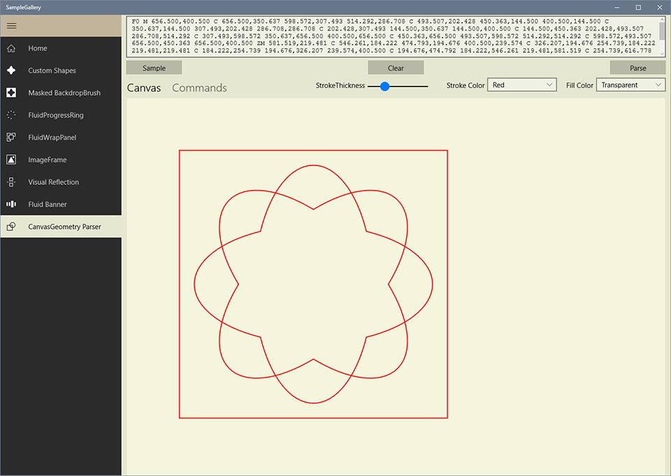
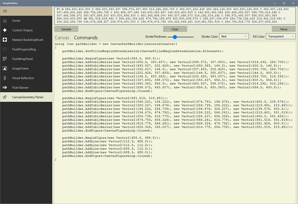
Check out the Sample Gallery project where you can interact with the CanvasObject class by providing the SVG/XAML path data and converting it to CanvasGeometry. You can alter the StrokeThickness, StrokeColor and FillColor of the rendered geometry.

You can view the CanvasPathBuilder commands called to create the parsed geometry.

Creating multilayer Vector shapes with CanvasElement

The CanvasElement class allows the creation of multilayer vector shapes. Each layer is represented by the CanvasRenderLayer class. The CanvasRenderLayer implements the ICanvasRenderLayer interface which encapsulates three properties required for rendering a layer

  • CanvasGeometry – The geometry to be rendered on the layer.
  • ICanvasBrush – The brush to fill the geometry.
  • ICanvasStroke – The stroke to outline the geometry.

The CanvasRenderLayer provides several constructors which accept the CanvasGeometry, ICanvasBrush and ICanvasStroke objects or their respective data definition strings.

public CanvasRenderLayer(CanvasGeometry geometry, ICanvasBrush brush,
    ICanvasStroke stroke);
public CanvasRenderLayer(ICanvasResourceCreator creator, string geometryData,
    string brushData, string strokeData);
public CanvasRenderLayer(ICanvasResourceCreator creator, string geometryData,
    ICanvasBrush brush, Color strokeColor, float strokeWidth = 1f);
public CanvasRenderLayer(ICanvasResourceCreator creator, string geometryData,
    ICanvasBrush brush, Color strokeColor, float strokeWidth, 
    CanvasStrokeStyle strokeStyle);
public CanvasRenderLayer(ICanvasResourceCreator creator, string geometryData,
    ICanvasBrush brush, ICanvasBrush strokeBrush, float strokeWidth = 1);
public CanvasRenderLayer(ICanvasResourceCreator creator, string geometryData, 
    ICanvasBrush brush, ICanvasBrush strokeBrush, float strokeWidth, 
    CanvasStrokeStyle strokeStyle);

The CanvasElement class implements the ICanvasElement interface which provides the following properties and APIs

interface ICanvasElement
{
    List Layers { get; set; }
    bool ScaleStroke { get; set; }
void Render(CanvasDrawingSession session, float width, float height, Vector2 offset,
    Vector4 padding, float rotation);

SpriteVisual CreateVisual(ICompositionGenerator generator, float width, float height,
    Vector2 offset, Vector4 padding, float rotation);

}

The Render API renders the CanvasElement layers on a CanvasControl or a CanvasAnimated control for the given dimensions, offset, padding and rotation.

The CreateVisual API creates a SpriteVisual which contains several SpriteVisuals, each representing a layer of the CanvasElement.

The constructor of CanvasElement requires the base dimensions of the element, the layers of the CanvasElement and an option whether to scale the stroke width when the CanvasElement is scaled (default is true).

public CanvasElement(float baseWidth, float baseHeight, IEnumerable layers,
            bool scaleStroke = true);

Using the base dimension, the CanvasLayer is able to scale its layers to any valid dimensions.

The layers are rendered based on their order in the layers list, i.e. the first layer in the list is rendered first and the subsequent layers are drawn on top of the previous layer. Thus the first layer in the list appears at the bottom and the last layer in the list is rendered top most.

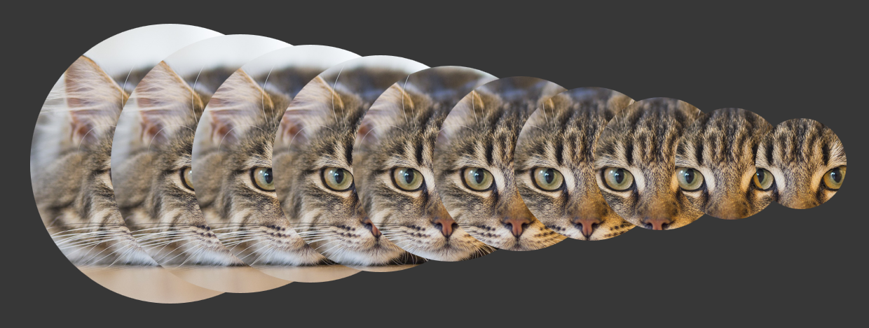
CanvasElement can be primarily used to create vector based icons for UWP applications.

The following example code

CanvasElement _element;

private void OnCanvas_CreateResources(CanvasControl sender, CanvasCreateResourcesEventArgs args)
{
    var geom1 = CanvasObject.CreateGeometry(sender, "O 116 116 128 128");
    var fill1 = CanvasObject.CreateBrush(sender, "SC #00adef");
    var stroke1 = CanvasObject.CreateStroke(sender, "ST 8 SC #2a388f");
    var layer1 = new CanvasRenderLayer(geom1, fill1, stroke1);
    
    var geom2 = CanvasObject.CreateGeometry(sender, "U 56 56 64 64 8 8");
    var fill2 = CanvasObject.CreateBrush(sender, "SC #ed1c24");
    var stroke2 = CanvasObject.CreateStroke(sender, "ST 2 SC #404041");
    var layer2 = new CanvasRenderLayer(geom2, fill2, stroke2);

    var geom3 = CanvasObject.CreateGeometry(sender, "U 136 56 64 64 8 8");
    var fill3 = CanvasObject.CreateBrush(sender, "SC #38b449");
    var layer3 = new CanvasRenderLayer(geom3, fill3, stroke2);

    var geom4 = CanvasObject.CreateGeometry(sender, "U 56 136 64 64 8 8");
    var fill4 = CanvasObject.CreateBrush(sender, "SC #fff100");
    var layer4 = new CanvasRenderLayer(geom4, fill4, stroke2);

    var geom5 = CanvasObject.CreateGeometry(sender, "R 96 96 64 64");
    var fill5 = CanvasObject.CreateBrush(sender, "SC #f7931d");
    var layer5 = new CanvasRenderLayer(geom5, fill5, stroke2);

    var layers = new List { layer1, layer2, layer3, layer4, layer5 };
    _element = new CanvasElement(256f, 256f, layers);
}

private void OnCanvas_Draw(CanvasControl sender, CanvasDrawEventArgs args)
{
    _element?.Render(args.DrawingSession, 512f, 512f, Vector2.Zero, new Vector4(10), 0f);
}

will create the following

Utility methods and Constants

Float constants

The following floating point constants have been defined in the static class Float

  • Float.Pi – same as (float)Math.PI radians (180 degrees).
  • Float.TwoPi – Two times (float)Math.PI radians (360 degrees).
  • Float.PiByTwo – half of (float)Math.PI radians (90 degrees).
  • Float.PiByThree – one third of (float)Math.PI radians (600 degrees).
  • Float.PiByFour – one fourth of (float)Math.PI radians (45 degrees).
  • Float.PiBySix – one sixth of (float)Math.PI radians (30 degrees).
  • Float.ThreePiByTwo – three times half of (float)Math.PI radians (270 degrees).
  • Float.DegreeToRadians – 1 degree in radians.
  • Float.RadiansToDegree – 1 radian in degrees.

ToSingle extension method

The Single() extension method for System.Double is now marked as obsolete. Your code will still work, but you will receive a warning during build.

The Single() extension method is now replaced with ToSingle() extension method. It does the same job – converts System.Double to System.Single.

The latest code is available in GitHub and the Nuget package is available here.

CompositionProToolkit v0.5.0 Holiday Edition released!

After a long gap, I am back with another update to CompositionProToolkit. This time I have added a few helper classes for the Win2d project.

CanvasPathBuilder extension methods

CanvasPathBuilder allows you to create a freeform path using lines, arcs, Quadratic Beziers and Cubic Beziers. You can then convert this path to a CanvasGeometry. Each path is composed of one or more figures. Each figure definition is encapsulated by the BeginFigure() and EndFigure() methods of CanvasPathBuilder.

If you want to add a circle(or ellipse) or a polygon figure to your path, you need to break the figure into curves or line segments and add them to the path one by one.

I have added the following extension methods to the CanvasPathBuilder to add a circle, ellipse or a polygon figure directly to your path

public static void AddCircleFigure (CanvasPathBuilder pathBuilder, Vector2 center, float radius);
public static void AddCircleFigure (CanvasPathBuilder pathBuilder, float x, float y, float radius);
public static void AddEllipseFigure(CanvasPathBuilder pathBuilder, Vector2 center, float radiusX, float radiusY);
public static void AddEllipseFigure(CanvasPathBuilder pathBuilder, float x, float y, float radiusX, float radiusY);
public static void AddPolygonFigure(CanvasPathBuilder pathBuilder, int numSides, Vector2 center, float radius);
public static void AddPolygonFigure(CanvasPathBuilder pathBuilder, int numSides, float x, float y, float radius);

In the AddPolygonFigure, the radius parameter indicates the distance between the center of the polygon and its vertices.

Note: These methods add the required curves or line segments to your path internally. Since these methods add a figure to your path, you can invoke them only after closing the current figure in the path. They must not be called in between BeginFigure() and EndFigure() calls, otherwise an ArgumentException will be raised. These extension methods call the BeginFigure() and EndFigure() CanvasPathBuilder methods internally.

CanvasGeometryParser

Last month, while working on my new UWP app, I was using Win2d extensively and found out that in Win2d there was no support for the Path Mini Langugage which is quite popular in WPF/Silverlight. It is a powerful and complex mini-language which you can use to specify path geometries more compactly using Extensible Application Markup Language (XAML). It is derived mainly from the SVG (Scalable Vector Graphics) Path language specification. Here is an example

    M8.64,223.948c0,0,143.468,3.431,185.777-181.808c2.673-11.702-1.23-20.154,1.316-33.146h16.287c0,0-3.14,17.248,1.095,30.848c21.392,68.692-4.179,242.343-204.227,196.59L8.64,223.948z

So I added the CanvasGeometryParser class which parses the above string and converts it into appropriate CanvasPathBuilder commands. It contains the following static methods

public static CanvasGeometry Parse(ICanvasResourceCreator resourceCreator, System.String pathData, StringBuilder logger = null);

The logger parameter in this method is an option argument of type StringBuilder which can be used to obtain the CanvasPathBuilder commands in text format. It is mainly intended for information/debugging purpose only.

Here is an example usage of the CanvasGeometryParser

private void OnCanvasDraw(CanvasControl sender, CanvasDrawEventArgs args)
{
    string data = "M8.64,223.948c0,0,143.468,3.431,185.777-181.808c2.673-11.702-1.23-20.154," + 
        "1.316-33.146h16.287c0,0-3.14,17.248,1.095,30.848c21.392,68.692-4.179,242.343-204.227,196.59L8.64,223.948z";
    var geometry = CanvasGeometryParser.Parse(sender, data);

    args.DrawingSession.FillGeometry(geometry, Colors.Yellow);
    args.DrawingSession.DrawGeometry(geometry, Colors.Black, 2f);
}

Check out the Sample Gallery project in GitHub where you can interact with the CanvasGeometryParser by providing the SVG/XAML path data and converting it to CanvasGeometry. You can alter the StrokeThickness, StrokeColor and FillColor of the rendered geometry.

canvasgeometryparser

You can view the CanvasPathBuilder commands called to create the parsed geometry.

CanvasGeometryParser_cmds.jpg

Based on the SVG (Scalable Vector Graphics) Path language specification, the following rules must be followed to create the path data

  • All instructions are expressed as one character (e.g., a moveto is expressed as an M).
  • Superfluous white space and separators such as commas can be eliminated (e.g., M 100 100 L 200 200 contains unnecessary spaces and could be expressed more compactly as M100 100L200 200).
  • The command letter can be eliminated on subsequent commands if the same command is used multiple times in a row (e.g., you can drop the second “L” in M 100 200 L 200 100 L -100 -200 and use M 100 200 L 200 100 -100 -200 instead).
  • Relative versions of all commands are available (uppercase means absolute coordinates, lowercase means relative coordinates).

In the table below, the following notation is used:

() indicates grouping of parameters.

+ indicates 1 or more of the given parameter(s) is required.

Command Command Letter Parameters Remarks
MoveTo M (x y)+ Starts a new sub-path at the given (x,y) coordinate. If a moveto is followed by multiple pairs of coordinates, the subsequent pairs are treated as implicit lineto commands.
ClosePath Z none Closes the current subpath by drawing a straight line from the current point to current subpath’s initial point.
LineTo L (x y)+ Draws a line from the current point to the given (x,y) coordinate which becomes the new current point.
HorizontalLineTo H (x)+ Draws a horizontal line from the current point (cpx, cpy) to (x, cpy).
VerticalLineTo V (y)+ Draws a vertical line from the current point (cpx, cpy) to (cpx, y).
CubicBezier C (x1 y1 x2 y2 x y)+ Draws a cubic BĂ©zier curve from the current point to (x,y) using (x1,y1) as the control point at the beginning of the curve and (x2,y2) as the control point at the end of the curve.
SmoothCubicBezier S (x2 y2 x y)+ Draws a cubic BĂ©zier curve from the current point to (x,y). The first control point is assumed to be the reflection of the second control point on the previous command relative to the current point. (If there is no previous command or if the previous command was not an C, c, S or s, assume the first control point is coincident with the current point.)
QuadraticBezier Q (x1 y1 x y)+ Draws a quadratic BĂ©zier curve from the current point to (x,y) using (x1,y1) as the control point.
SmoothQuadraticBezier T (x y)+ Draws a quadratic BĂ©zier curve from the current point to (x,y). The control point is assumed to be the reflection of the control point on the previous command relative to the current point. (If there is no previous command or if the previous command was not a Q, q, T or t, assume the control point is coincident with the current point.)
Arc A (radiusX radiusY angle isLargeFlag SweepDirection x y)+ Draws an elliptical arc from the current point to (x, y).
EllipseFigure O (radiusX radiusY x y)+ Adds an Ellipse Figure to the path. The current point remains unchanged.
PolygonFigure P (numSides radius x y)+ Adds an n-sided Polygon Figure to the path. The current point remains unchanged.

The latest code is available in GitHub and the Nuget package is available here.

Happy Holidays! 🙂

CompositionProToolkit v0.4.6 released

Another update to CompositionProToolkit this week with couple of feature additions to ImageFrame and some bug fixes.

ImageFrame

Optimized Shadow

ImageFrame now provides a new dependency property called OptimizeShadow which allows multiple ImageFrame instances to share the same DropShadow instance. You can set this property to True when you are displaying several ImageFrame instances within a single container and each ImageFrame instance has shadow enabled. This will reduce the memory footprint.

Dependency Property Type Description Default Value
OptimizeShadow Boolean Indicates whether the ImageFrame should use a shared shadow object to display the shadow. False

IDisposable

ImageFrame now implements the IDisposable interface and thus provides a Dispose method to free up resources. ImageFrame internally uses several Composition objects which must be disposed to optimize the memory usage within your app.

Guidelines for effectively disposing ImageFrame

Consider a scenario where you are displaying several ImageFrame instances in a GridView within a page. When the app navigates away from the page, then you must dispose the ImageFrame instances like this

protected override void OnNavigatedFrom(NavigationEventArgs e)
{
    foreach (var imgFrame in ItemGridView.GetDescendantsOfType())
    {
        imgFrame.Dispose();
    }    
    VisualTreeHelper.DisconnectChildrenRecursive(ItemGridView);
    ItemGridView.ItemsSource = null;
    ItemGridView.Items?.Clear();

    base.OnNavigatedFrom(e);
}

Frosted Glass Effect Brush

A new extension method CreateFrostedGlassBrush has been added to Compositor which, as the name suggests, allows you to create a custom shaped brush which gives a frosted glass effect. The main difference between this method and the CreateMaskedBackdropBrush is that when you apply the FrostedGlassBrush to a visual with a DropShadow, it will look better, whereas with the MaskedBackdropBrush, the shadow will darken the visual.

FrostedGlassEffect.png

You can obtain the mask from the FrostedGlass effect brush, to apply to the DropShadow, in the following way

var roundRectGeometry = CanvasGeometry.CreateRoundedRectangle(_generator.Device, 
    0, 0, _width, _height, 25, 25);
var maskSurface = _generator.CreateMaskSurface(visual.Size.ToSize(),
     roundRectGeometry);
var frostedBrush = _compositor.CreateFrostedGlassBrush(maskSurface,
     Colors.AntiqueWhite, 30f, _backdropBrush);

var shadow = _compositor.CreateDropShadow();
shadow.Opacity = 0.5f;
shadow.Color = Colors.Black;
shadow.Offset = new Vector3(10, 10, 0);
shadow.BlurRadius = 15;

// Apply the mask to the shadow
shadow.Mask = frostedBrush.GetSourceParameter("mask");

visual.Brush = frostedBrush;
visual.Shadow = shadow;

The FrostedGlass effect brush was inspired from this blog post.

The latest source code is available in GitHub and the NuGet package is available here.